In some parts of the world, like Japan, the business card holds an important place in society. Since the advent of smartphones and social media, it has become commonplace for people to overlook business cards and even for them to think that they are dead. However, business cards are alive and kicking, not just in Japan, but also in other parts of the world like the United States. They tell clients and collaborators who you are and give them a window into your personal interests and tastes.
This post will tell you how you can design an eye-catching business card.

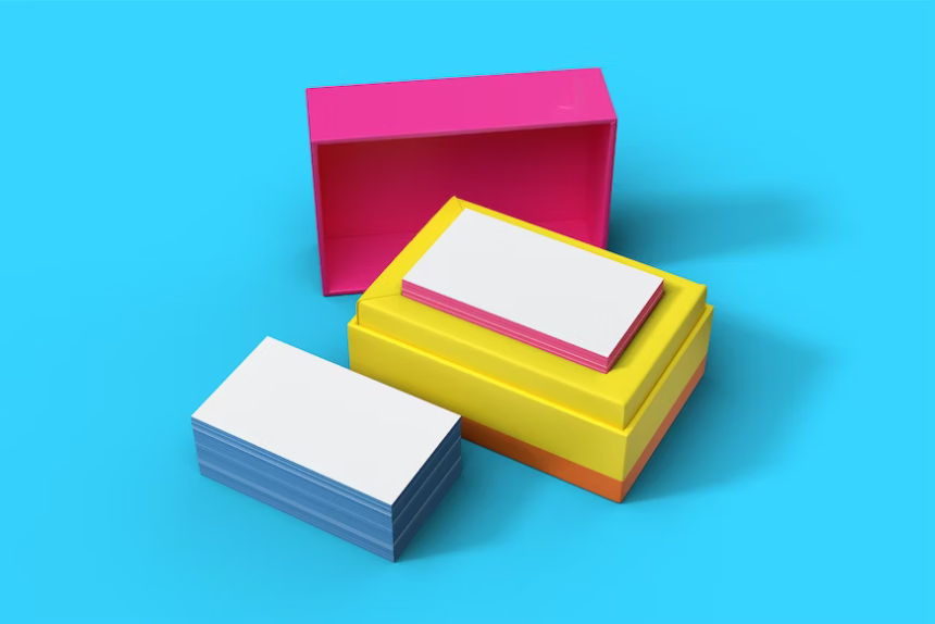
Think About Paper
A meme has emerged on the Internet, stemming from Christian Bale’s American Psycho. The lead character, Patrick Bateman, has a meltdown over the quality of the paper of one of his colleague’s business cards. However, art imitates life, at least in this case. It is very common for professionals to take their cards extremely seriously. If a person’s card is better than another’s then this can bring about feelings of shame and inadequacy in the individual whose card was not of better make. You, therefore, need to think about the quality of the paper used to create your card. Better than paper, why not invest in metallic business cards, because there’s nothing more solid and durable than metal. Metallic business cards are so unique that they’ll capture the attention of everybody who comes across them and won’t disintegrate and deteriorate as paper does.
Consider the Font
The font used on your card is something else that you need to think carefully about. If the font you choose isn’t a professional one then it can make your card look immature and childish. Times New Roman is a popular font for business cards. Helvetica and Arial are popular, too. Before you finalize your card it’s worth asking for an example copy to be sent out to you with several different fonts on them. The manufacturers of most business cards will be more than happy to oblige you. If you are ordering metal cards, you may have to pay for example copies, however, the amount you will owe likely won’t be a lot. If you choose paper cards due to the low costs associated with manufacturing you should not theoretically have to make any financial contributions towards the cost of manufacturing.
Related Posts

Italics or Bold?
The last thing you need to think about is the accent of the font. Do you want it to be bold or do you want it to be in italics? Italics tend to look very professional. You could even mix italics and bold. Before you do this, again, get an example card. Getting an example card helps you to get a feel for how your card is going to look upon arrival. You may also want to consider whether you want the font engraved or printed. If it is engraved, it will cost a little more, especially for metal.
Eye-catching business cards give you the impression of superiority in the office. They make you look professional and serious. Because of this, it is definitely worth investing in them. You can use this post’s guidance to make yours.