Is your website style outdated and is it designed for optimal efficiency?
Choosing and customizing website themes is a huge factor in a site’s success. The visuals and layout can make or break people’s experience navigating your website.
So how do you know you’re doing it right? What kind of style mistakes should you avoid?
Don’t worry, we’ve already listed them down for you. Continue reading to learn all the style mistakes to break away from:

1. Lack of CTA
Does your site look pretty but it’s still not generating leads or conversions? The problem might not be in the site’s general style. The issue might be with the lack of a clear call to action (CTA).
Make it a point to add understandable CTAs where you can. It’s okay to be a bit direct.
Let visitors know where to subscribe, what to click to buy, or where to get in touch with you. Simple CTAs like these, placed strategically around your site, will keep visitors engaged with your business.
Not sure how or where to place your CTA? If you lack proper spots to put one in, that leads to the next mistake to avoid: a lack of grids and columns.
2. No Clear Grids and Columns
The best website styles, even from the 1990s, had clear grids and columns. These help direct a visitor’s eyes to important portions of each page. It also brings an air of familiarity, even if it’s their first time checking out your content.
Having clear grids and columns also keep your site visually organized.
For example, a common practice is to keep the main menu tabs on the upper grid. Some designers place the menu in the left-hand column. The middle column is often kept untouched and wide because it’s for the body of each page.
The visual style of columns and grids changed throughout the years. Go back a decade ago and you’ll see websites with clear borders. This is no longer the case and you’ll even see sites now that focus on scrolling down horizontal rows instead of columns.
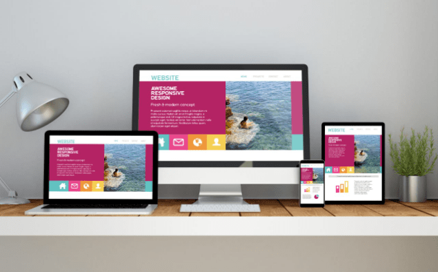
3. Non-Responsive Website Design
Any 2021 website should feature a responsive design. This ensures that your site will automatically reshape and resize itself according to the size of the screen viewing it. This is particularly important for people viewing your website on a phone.
Most people browse the Internet through their phones, after all. The problem with this is that no two phones are the same. The size of an iPhone’s screen is different from that of a Google Pixel or a Samsung Galaxy.
Responsive web design resolves this.
However, you can’t simply rely on an automatic conversion. Websites made on WordPress can flip a switch to turn their website into a responsive one, depending on the theme or plugin, but that’s not enough.
It’s also important to style your website in a way that caters to the mobile crowd. One thing to keep in mind is your choice of colors.
4. Bad Color Theme
Yes, colors play a part too. For one thing, you shouldn’t simply pick colors based on which one is your favorite.
Take basic color psychology into consideration. Keep in mind that every color can cause subtle emotional responses.
If you’re running a formal website intended for stockbrokers or real estate purposes, go with a black and white or silver color scheme. If you want to push people to click a “buy now” button, color it with a shade of red or yellow.
At the end of the day, it’s about using the right colors to encourage site visitors towards portions of your site you want them to engage. Picking colors randomly could push them away instead.
5. Forgetting Accessibility
It’s 2021 and accessibility and inclusion are big factors to consider now. After all, it’s now possible for people with vision impairment or motor incapabilities to still browse your site. You need a website theme that caters to their special needs too.
Start with having options for colorblind visitors. You can have a few options that will automatically adjust your website’s colors for those who have protanopia, deuteranopia, or tritanopia. If you can, add a visual slider so that they can adjust the colors themselves.
What about people who are blind? You can address this by adding text-to-speech on your site. The audio cues will help them navigate the site.
6. Ignoring Good UX Design
Your website style should prioritize intuitive website navigation. For example, it shouldn’t take more than three clicks to get to any page on your website. If it takes more than that, you risk a visitor leaving because they can’t find what they want or need.
Another good example is to include a search bar. If visitors don’t know which menus to navigate, they can simply use the search bar to find it. A search bar is also good for SEO purposes because now you can see the top keywords people use on your site.
Did they reach the bottom of the page? That’s great but do visitors now have to scroll all the way back up? Add a “back to top” button for convenience and it’ll prevent people from clicking elsewhere.
Perfecting a site’s UX is no easy task. This is one of the things you’ll want to delegate to a professional designer, like the folks at Hilton Website Design.
7. Cluttered Website Style
Don’t try to fill every inch of your site with something! Ignoring the function and beauty of negative space leads to a poor website style. It looks messy and cluttered.
A cluttered site is also difficult to navigate. People won’t be able to spot the things you want them to notice. How can they spot an “add to cart” button if it’s small and surrounded by all sorts of pictures and walls of text?
Use white space to your advantage. Give important elements room to breathe.
This also goes back to using clear grids and columns. Divide your site’s space and don’t try to fill up each inch with text or pictures. When there’s something important, like a subscribe button or the links to your social media pages, keep some space around them.
8. Social Media Links Are Too Prominent
Speaking of social media, it’s easy to make them too prominent!
It’s important to provide links to your social media pages, yes, but don’t put the links upfront and center. Don’t make them too prominent. Doing so will encourage people on your site to check out your social media pages and ignore your website.
You want people to stay on your site, not to leave it. If they’ll visit your Facebook Page or Instagram, it has to be after they subscribe, read a blog post, or buy something. The move to visit your social media corners comes after performing a profitable action on your website.
One good way to work around this is to keep your social media links tucked in your Contact Us page or at the bottom of the page. This ensures people will still see them but only after going through your content.
9. Content Isn’t Scannable
A good web layout means people can find what they need or want quickly and without fuss. A scannable web page is a good one. Even with all the pictures and text, it should still take less than a minute to find an important detail or link.
Start by breaking down your posts. They shouldn’t look like giant walls of text. Keep paragraphs limited to only a few sentences and break the monotony with pictures or videos.
Use headers so people can break down segments of your posts. Make sure to underline links and keep them differently colored. A simple mouse-hover over links can also help keep your pages scannable.
10. Unclear Branding
Another common website style mistake is to confuse people regarding your brand. A person should automatically understand what kind of tone your site represents simply from the style and colors alone. However, this goes beyond using smart color psychology.
Ensure that your brand shines through your site’s design and style. If your website is for a Christian organization, people should know simply from the color scheme, images, and layout. There shouldn’t be anything that distracts from the theme and tone.
Avoid These Web Design Mistakes Today
There are a lot of mistakes to avoid when it comes to perfecting your website style and layout. From unclear branding to ignoring good UX and color psychology, these mistakes can easily dissuade people from exploring your website.
Remedy these by testing your site and seeking the aid of a professional web design agency. Experts can assist you audit your site’s style and design, ensuring you’ll get optimal results even before you go live.
But why stop learning with these ten tips? We’ve got a plethora of web design and marketing guides for you to explore, so don’t hesitate to keep reading right here!